Mapping the Number of Foreign Currency Deposit Accounts across Turkish Cities - 2010 vs. 2020
By Muhammet Ozkaraca
December 20, 2021
In recent years, the Turkish lira has depreciated significantly against foreign currencies. To hedge against this depreciation along with the increasing inflation, several Turkish people have converted their funds to other currencies, mainly the US dollar and the Euro. This process leads them to open bank accounts in foreign currencies. In this post, I will attempt to visualize this process by mapping the number of foreign currency accounts by Turkish cities. My analysis will entail a comparison of 2010 and 2020. To this end, I will utilize “Number of Foreign Currency Deposit Accounts” data from the Banks Association of Turkey1. The geospatial data I will use in this post will come from the GADM. As written in its website, please note that the GADM data cannot be used for commercial purposes.
In the first stage, I will download data from both sources. After tidying the Number of Foreign Currency Deposit Accounts data, I will merge it with the geospatial data. Finally, I will try to make the map to demonstrate the change in foreign currency deposit accounts by Turkish cities.
Introductory Steps
As a first step, I will download data from the Banks Association of Turkey. When you click on the previous highlighted link, you will see that there are 3 main columns, namely:
Geographical Regions and Provinces, Periods, Parameters. Please choose Select All in the Geographical Regions and Provinces part by excluding all rows until Istanbul. In the Periods, we can select only 2010 and 2020 since we will only use these. Finally, in the Parameters part, I kindly ask you to select Number of Foreign Currency Deposit Accounts since this is the data we will use in this post. After that, you can click on Report and, by clicking on the Excel icon on the new page, you can download the data onto your computer automatically.
In a similar manner, let’s move on the GADM website and please select Turkey from the country list, as well as click on Shapefile and download the data.
Now, let’s load the required packages and the data into our working space and start exploring the data.
Installing Libraries and the data into R
options(scipen=999) # to prevent scientific notation
library(readxl) # to read excel files
library(tidyverse) # for data analysis purposes and visulization -> tidyverse mainly contains ggplot2 and dplyr
library(viridis) # to make visualisations
library(sf)      # to read geospatial data
Now, let’s install data in R and look at the head of Number of Foreign Currency Deposit Accounts data.
Code
# Be careful about where your R working directory is and where your downloaded data is located. If your data is not in the same place where your R working directory is, then R cannot read the data.

foreign_currency_accounts <- read_excel("~/Desktop/PivotGrid-3.xlsx")
tur_spatial <- read_sf("~/Desktop/gadm41_TUR_shp/gadm41_TUR_1.shp")
head(foreign_currency_accounts)
Output
## # A tibble: 6 × 4
##   ...1                    ...2                `2010`        `2020`
##   <chr>                   <chr>                <dbl>         <dbl>
## 1 Döviz Tevdiat Hesapları İstanbul       79516701000 735192229941.
## 2 <NA>                    Adana           1558501000  18777083000
## 3 <NA>                    Adıyaman         113827000   1544978000
## 4 <NA>                    Afyonkarahisar   602922000   6341883000
## 5 <NA>                    Ağrı             146281000    571801000
## 6 <NA>                    Aksaray          720583000   5796032000
As can be seen from the output, the data frame format for the Number of Foreign Currency Deposit Accounts is not convenient to conduct further analysis. So, we will need a brief data cleaning effort here. Please also note that we specifically choose the gadm41_TUR_1.shp file to read into the working space as it contains geospatial data on the boundaries of the Turkish cities.
Code
colnames(foreign_currency_accounts) <- c("", "cities", "2010", 2020)

foreign_currency_accounts <- foreign_currency_accounts %>%
  select("cities", "2010", "2020") %>%
  pivot_longer(!"cities", names_to = "years", values_to = "account_numbers")

head(foreign_currency_accounts)
Output
## # A tibble: 6 × 3
##   cities   years account_numbers
##   <chr>    <chr>           <dbl>
## 1 İstanbul 2010     79516701000
## 2 İstanbul 2020    735192229941.
## 3 Adana    2010      1558501000
## 4 Adana    2020     18777083000
## 5 Adıyaman 2010       113827000
## 6 Adıyaman 2020      1544978000
Let us revise what we have done so far. We first renamed the column names in our data set to as it would not lead to further misunderstandings. Then, by using select function from the dplyr package, we selected 3 crucial columns for our analysis from the main dataset. They are, namely, cities, 2010, and 2020. Following that, as we wanted the years to be stored in a new column named years, and the values corresponding to them in a new column named account_numbers, we used the powerful pivot_longer function from the dplyr package.
!"cities" told R not to touch this column. names_to told R to store 2010, and 2020 in a new column named years and the corresponding values went to the new account_numbers column by using values_to argument. Before moving on, if you want to have a further look at pivot_longer() function, you can try this website.
Now, let’s focus on the tur_spatial data and view the data.
Code
head(tur_spatial)Output
## Simple feature collection with 6 features and 11 fields
## Geometry type: MULTIPOLYGON
## Dimension: XY
## Bounding box: xmin: 29.66377 ymin: 36.53847 xmax: 44.49647 ymax: 41.09054
## Geodetic CRS: WGS 84
## # A tibble: 6 × 12
## GID_1 GID_0 COUNTRY NAME_1 VARNA…¹ NL_NA…² TYPE_1 ENGTY…³ CC_1 HASC_1 ISO_1
## <chr> <chr> <chr> <chr> <chr> <chr> <chr> <chr> <chr> <chr> <chr>
## 1 TUR.1_1 TUR Turkey Adana Seyhan NA Il Provin… NA TR.AA TR-01
## 2 TUR.2_1 TUR Turkey Adiya… Adıyam… NA Il Provin… NA TR.AD TR-02
## 3 TUR.3_1 TUR Turkey Afyon Afyonk… NA Il Provin… NA TR.AF NA
## 4 TUR.4_1 TUR Turkey Agri Ağri|K… NA Il Provin… NA TR.AG TR-04
## 5 TUR.5_1 TUR Turkey Aksar… NA NA Il Provin… NA TR.AK TR-68
## 6 TUR.6_1 TUR Turkey Amasya NA NA Il Provin… NA TR.AM TR-05
## # … with 1 more variable: geometry <MULTIPOLYGON [°]>, and abbreviated variable
## # names ¹VARNAME_1, ²NL_NAME_1, ³ENGTYPE_1Now, as a second step, we need to merge Number of Foreign Currency Deposit Accounts data with tur_spatial data so that we can have corresponding values stored for the relevant cities to make the map we are aiming for.
Merging Datasets
This step has another tricky part as it requires a careful examination with regards to Turkish cities’ names due to the punctuation differences between the two datasets we are working on. While this problem occurs because of the nature of the Turkish language, with a careful examination, we can handle this problem.
Code
tur_spatial <- tur_spatial %>%
  mutate(NAME_1 = case_when(NAME_1 == "Adiyaman" ~ "Adıyaman",
                            NAME_1 == "Afyon" ~ "Afyonkarahisar",
                            NAME_1 == "Agri" ~ "Ağrı",
                            NAME_1 == "Aydin" ~ "Aydın",
                            NAME_1 == "Balikesir" ~ "Balıkesir",
                            NAME_1 == "Çankiri" ~ "Çankırı",
                            NAME_1 == "Diyarbakir" ~ "Diyarbakır",
                            NAME_1 == "Eskisehir" ~ "Eskişehir",
                            NAME_1 == "Gümüshane" ~ "Gümüşhane",
                            NAME_1 == "Istanbul" ~ "İstanbul",
                            NAME_1 == "Izmir" ~ "İzmir",
                            NAME_1 == "K. Maras" ~ "Kahramanmaraş",
                            NAME_1 == "Kinkkale" ~ "Kırıkkale",
                            NAME_1 == "Kirklareli" ~ "Kırklareli",
                            NAME_1 == "Kirsehir" ~ "Kırşehir",
                            NAME_1 == "Mersin" ~ "İçel",
                            NAME_1 == "Mugla" ~ "Muğla",
                            NAME_1 == "Mus" ~ "Muş",
                            NAME_1 == "Nigde" ~ "Niğde",
                            NAME_1 == "Sanliurfa" ~ "Şanlıurfa",
                            NAME_1 == "Sirnak" ~ "Şırnak",
                            NAME_1 == "Tekirdag" ~ "Tekirdağ",
                            NAME_1 == "Usak" ~ "Uşak",
                            NAME_1 == "Zinguldak" ~ "Zonguldak",
                            TRUE ~ NAME_1))

colnames(tur_spatial)[4] <- "cities"

final_data <- tur_spatial %>%
  left_join(foreign_currency_accounts, by = c("cities"))

quantile(final_data$account_numbers, probs = seq(0, 1, 0.25), na.rm = FALSE)
Output
##           0%          25%          50%          75%         100%
##     16087000    214470250    903586500   3665321750 735192229941
The above code solved the punctuation differences between the two datasets we are working on and merged these two datasets accordingly. To elaborate on what we have done so far, we first eliminated the punctuation differences between the two datasets using case_when() function and then merged them into the final_data we will be using to make the map.2.
Also, note that with the quantile() function, we got an idea on distribution of the account_numbers(), which will help us to set the boundaries for the legend when we will be making the map later.
Visualize the Data
Now, as the last step, we will visualize our data with the following code chunk;
plot <- final_data %>%
  select(years, cities, account_numbers, geometry) %>%
  # filter(years == 2010) %>%
  ggplot() +#
  geom_sf(aes(fill = account_numbers), color = "white", lwd = 0.01) +
  facet_wrap(~years, nrow = 1) +
  theme_void() +
  labs(title = "Number of Foreign Currency Deposit Accounts in Banks by Province in Turkey",
       subtitle = "2010 vs. 2020",
       caption = "Source: Banks Association of Turkey") +
  scale_fill_viridis(name="Total Account Number", trans = "log",
                     breaks = c(16087000, 214470250, 903586500, 3665321750, 735192229941),
                     labels = c("0-16 M", "16 M- 214.5M", "214.5 M - 903.6 M", "903.6 M - 3.7 B", "3.7 B - 7.4 B"),
                     guide = guide_legend(keyheight = unit(1, units = "mm"),
                                          keywidth=unit(6, units = "mm"),
                                          label.position = "bottom", title.position = 'top',
                                          nrow=1)) +
  theme(plot.background = element_rect(fill = "#f5f5f2", color = NA),
        panel.background = element_rect(fill = "#f5f5f2", color = NA),
        legend.background = element_rect(fill = "#f5f5f2", color = NA),
        legend.text = element_text(size = 18),
        legend.title = element_text(size = 20),
        strip.text = element_text(size = 18),
        plot.title = element_text(size= 35, hjust = 0.5, color = "#4e4d47"),
        plot.subtitle = element_text(size= 24, hjust = 0.5, color = "#4e4d47"),
        plot.caption = element_text(size=24, color = "#4e4d47", hjust = 0.2),
        legend.position = c(0.5, 0),
        legend.direction = "horizontal")

knitr::include_graphics("featured.png")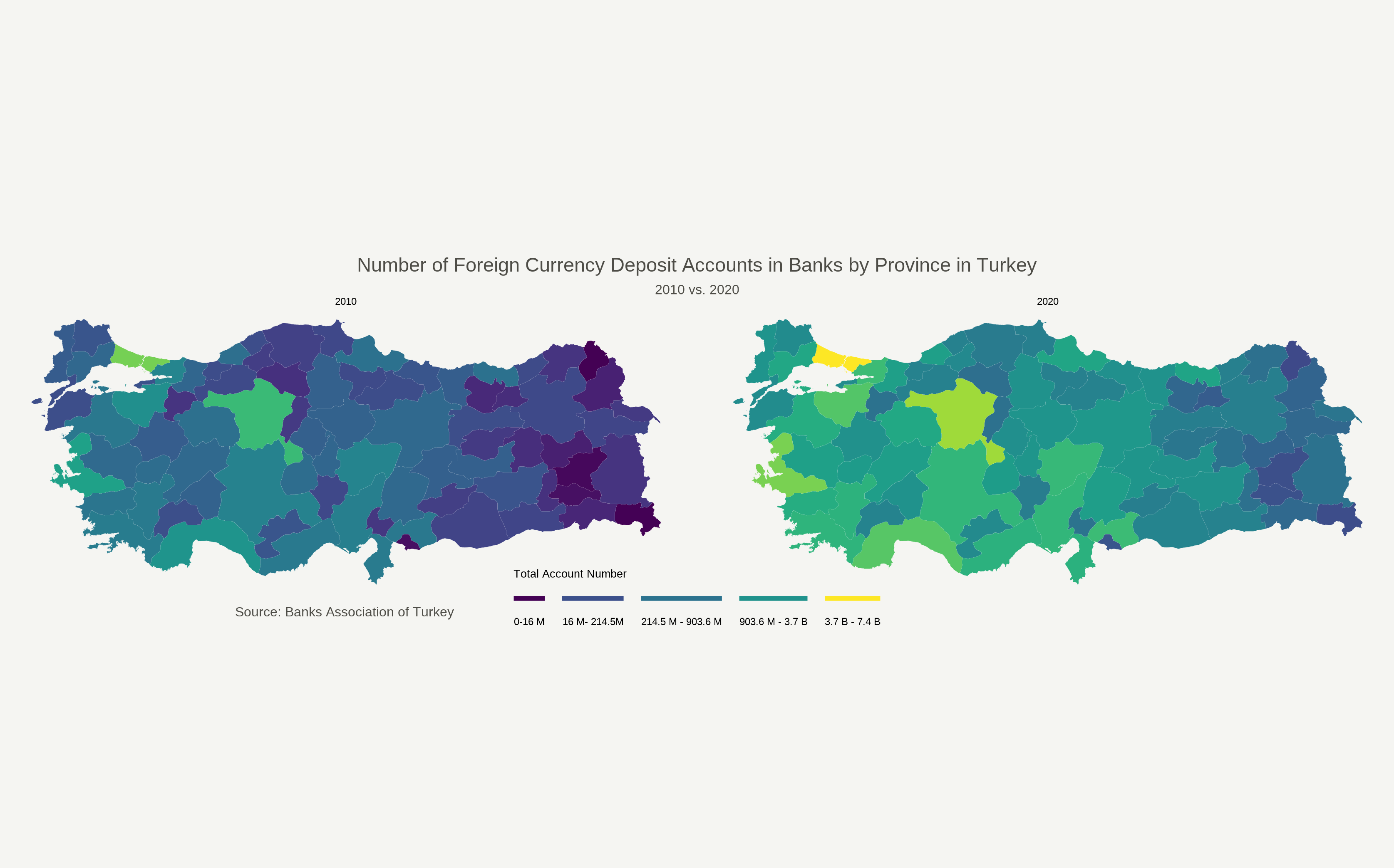
Voilà, here is our beautiful map that demonstrates a comparison of the number of foreign currency deposit accounts in Turkey between 2010 and 2020 by city-level. Before concluding our post, let us look at some specific arguments we made while making this plot.
- We want each city to be colored based on the corresponding number of foreign deposit accounts, so we write this
fill = account_numbers. If you would like to adjust the transparency of the colors for each city, you can customizealphaargument insidegeom_sf()function. 0 corresponds to full transparency, while 1 corresponds to full opacity. theme_voidargument provides a blank background. By usingscale_fill_viridis, we color our map. As the distribution ofaccount_numbersdata is not normal3, we can usetrans = "log"argument to see the change between 2010 and 2020 better.- Without going into further details, I want to lastly point out that
facet_wrap()function, which helps to see the comparison between the 2010 and the 2020. If you want to look further into the specifics of these arguments, this website has wonderful tutorials for making visualisations in R that I am sure will satisfy your needs.
To conclude, in this tutorial, I tried to make a visualization that demonstrates the amount of change in foreign currency deposit accounts across cities in Turkey between 2010 and 2020. I hope this post can help you in your own endeavors. If you have further questions and suggestions, please do not hesitate to reach me via muhammetozk@icloud.com.
In Turkish, Türkiye Bankalar Biriliği↩︎
Although I tried to explain the steps as simple as possible, if these explanations might not be convenient for you, I would recommend you look at this website to understand how to use
left_joinfunction↩︎we can find out this with a box plot using
boxplot(final_data$account_numbers)code↩︎
- Posted on:
- December 20, 2021
- Length:
- 9 minute read, 1838 words
- See Also: